Forget about new year, new you. This year, we declare it’s the year for MORE you. There are MORE colours to choose from, more ways to incorporate them into your home, your life, and your attitude. Thanks once again to Pantone, we have some clear guidance on just what MORE in 2022 looks like.
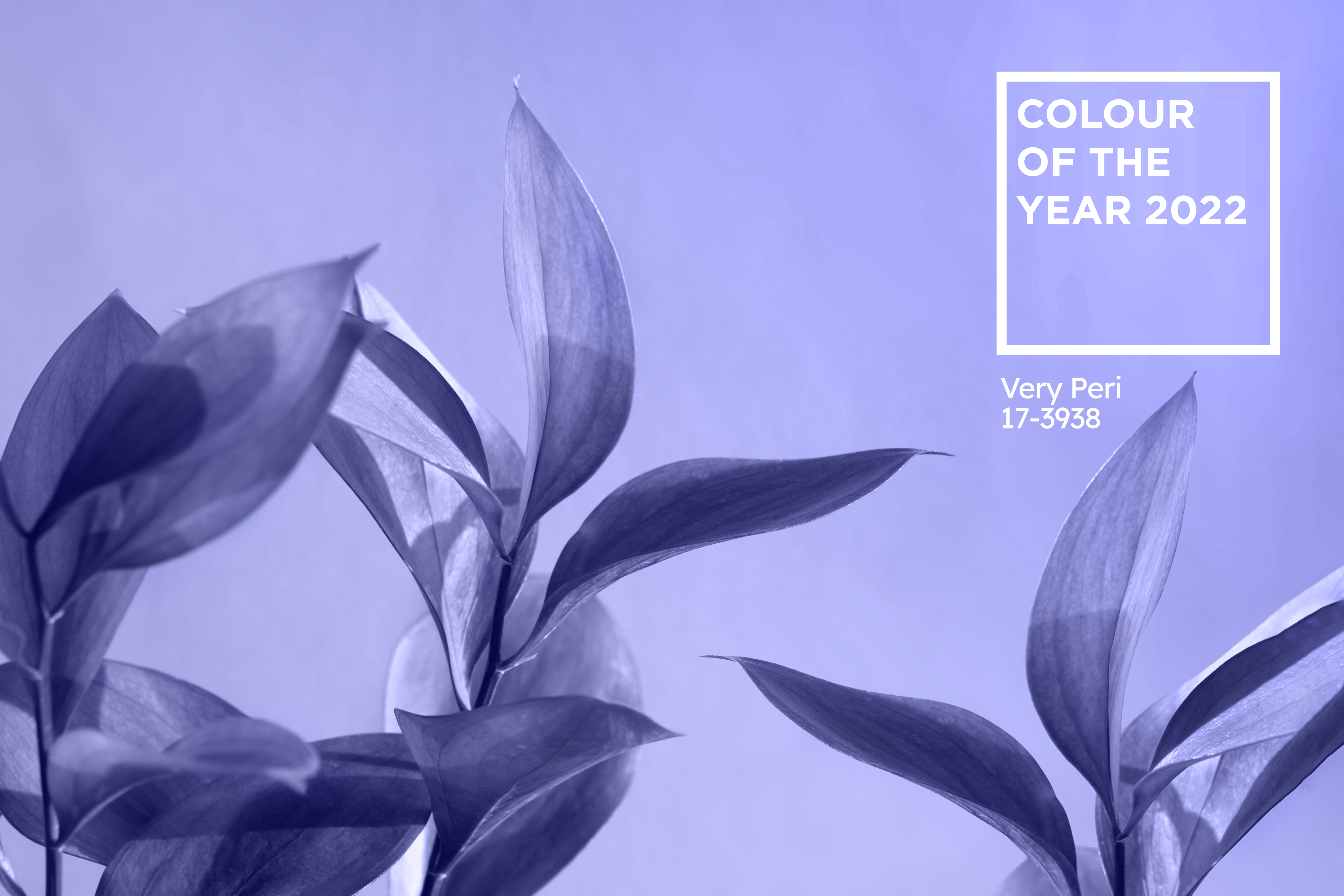
When it comes to decorating our homes and finding inspiration, a bright beacon every year is the PANTONE Colour of the Year, which for 2022 is Very Peri. This colour is a brand-new colour, which is also new to PANTONE. Yes, even PANTONE said, ‘more pantone!’ Previous years the colour is one which already existed.
It’s the appeal of newness setting Very Peri apart. There is nothing subtle about this bold colour and it’s the perfect choice as we leap (yet again) into the unknown with bold force and expectant energy.
Our friends at House Beautiful describe the Pantone Colour of the Year best by saying, “Very Peri is a dynamic periwinkle blue hue with a vivifying violet red undertone. Futuristic in feeling and encouraging inventiveness and creativity, Very Peri blends the faithfulness and constancy of blue with the energy and excitement of red.”
As both a new colour AND the colour of the year for 2022, Very Peri is rife with future opportunity but also a hint of nostalgia. It was poetic timing to see this colour announced almost simultaneously with Stanford in a Very Peri suit on the new Sex and the City: And Just Like That. What an entrance! It was the perfect introduction, and the world is here for it.

Expect to see this colour in various shades and applied to every single kind of texture you can imagine, from wallpapers to textiles, to furnishings. This colour hue is set to be everywhere you look in home décor, home furniture, paint, fashion and even in edible plants on your freshly foraged ethically sourced farm to table meal. Be prepared to see this bold, futuristic colour everywhere.
Not sure how to incorporate the Pantone Colour of the year into your home? Here are our tips for ushering in this bold futuristic and energetic hue into your home in 2022:
1. Start small
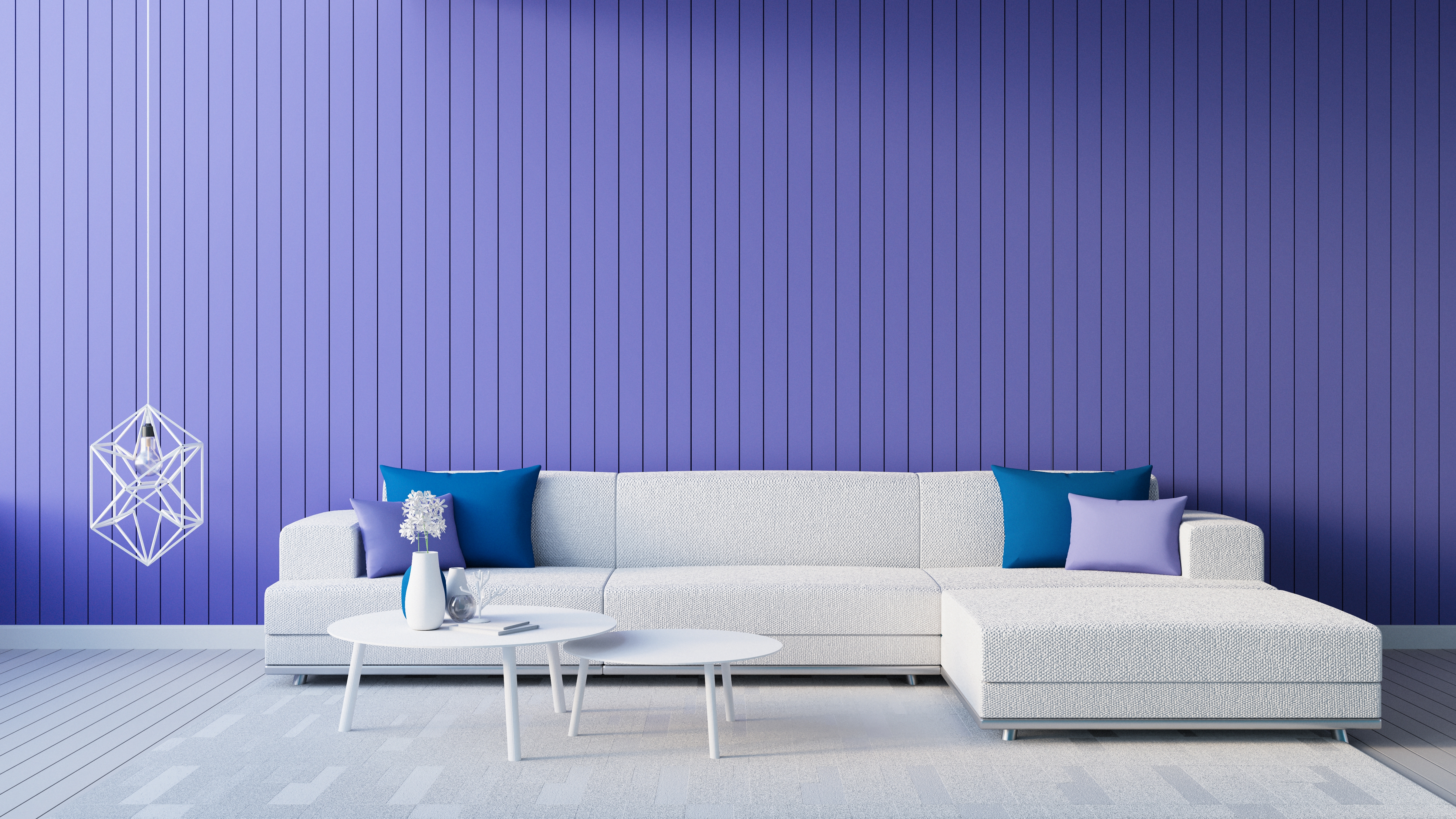
If you love this warm and sassy blue hue but aren’t totally sure it’s what your home needs, try adding into your home in bite sized doses. Try starting with a pillowcase or two for the sofa, or a lamp or vase. If you like it, you can always add more. If you totally love the colour however, we suggest…

2. Make one BIG, bold change
Yes, just go for it. Make one big bold change using Very Peri as your motivation. Paint a feature wall or invest in a new Very Peri coloured velvet sofa, recliner, or occasional chair for the office or living room.
But if a little or even a lot aren’t for you, don’t fret.
3. Very Peri has lots of friends
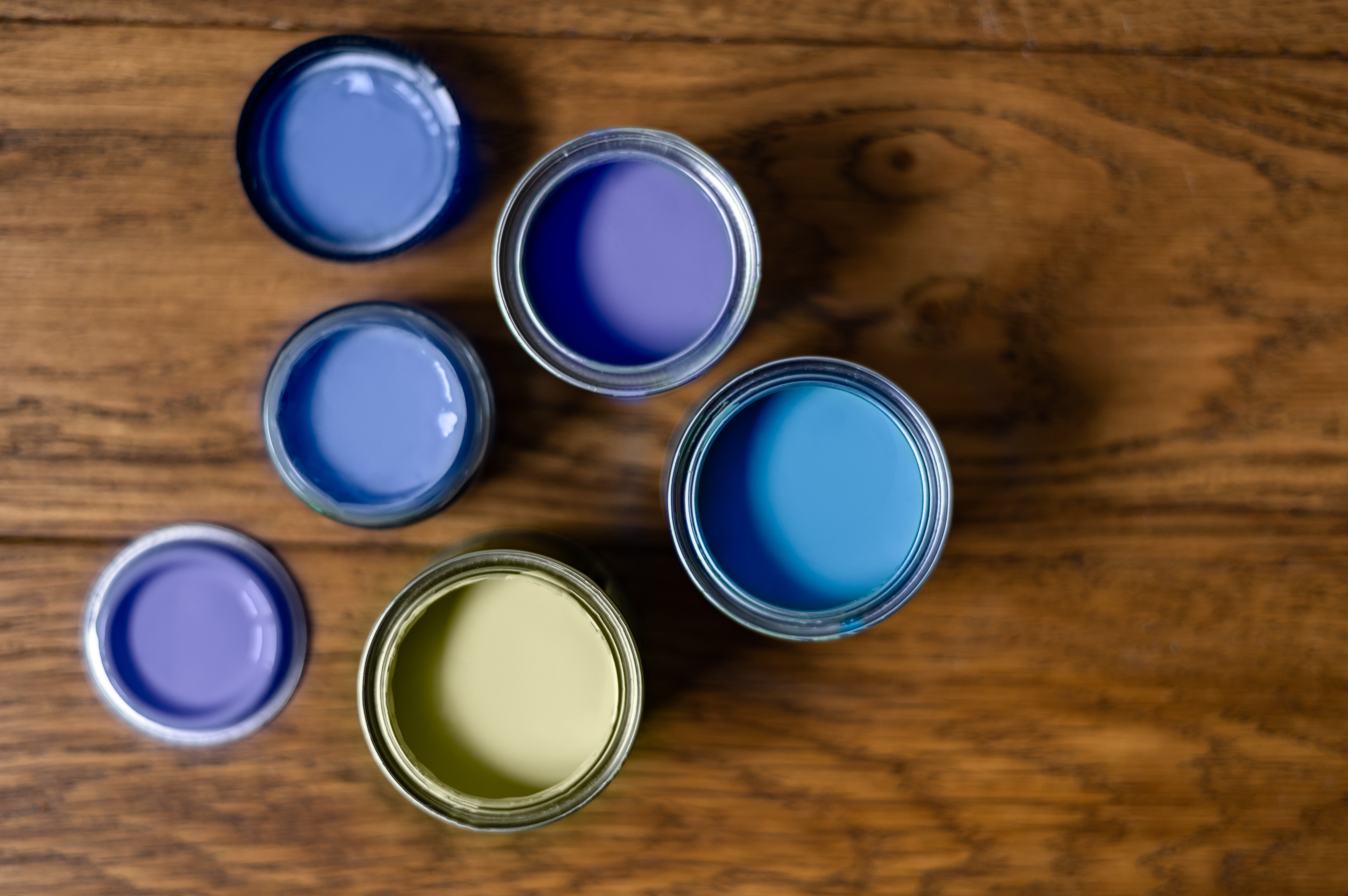
There are a variety of colours to help make your 2022 a bold and bright one, if Very Peri isn’t your style, look to all the beautiful colours PANTONE offers up as colour stories like ‘The Star of the Show’, ‘Amusements’, ‘Wellspring’, and ‘Balancing Act’. After all, we can’t all be Very Peri. In every group there is always a Carrie, a Charlotte, a Miranda, and Stanford (in his Very Peri suit). Pick your character and dive in to 2022 with confidence. No matter what your choice, PANTONE has a colour for it to bring more into your home, more joy, more calm, more energy, more love, and more colour.

Looking for more inspiration? Check out our other blog posts.
